.jpg)
Challenge
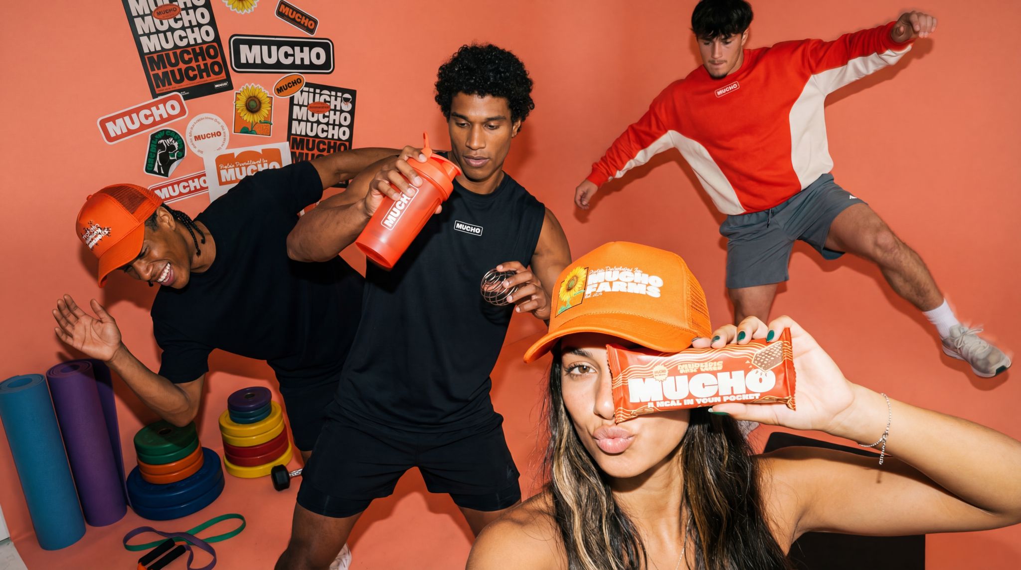
Mucho Brands came to DLS as a powerful idea, not a finished brand. The founders had identified a clear gap in the food space – a high-protein "meal in your pocket" for people who do not have time for a full sit-down meal – but had no positioning, no visual identity, no packaging system, and no story that buyers or investors could immediately grasp. If Mucho was going to launch into a crowded CPG landscape, it needed to enter the market already looking like a category leader, not a test.
Solution
DLS used the Revenue-Engineered Branding™ process to build Mucho from the ground up. We defined the category ("when a snack isn't enough and a meal is too much"), clarified the positioning and messaging around the "meal in your pocket" insight, and created a bold visual identity and packaging system designed to win attention on shelf and on screen. We then extended this into a cohesive digital presence and conversion-focused website to support retail and DTC growth from day one.
Impact
- Launched with clear, differentiated positioning and a brand that signaled category leadership
- Designed a packaging and collateral system that scaled cleanly across new SKUs
- Built a high-conversion website and digital presence to support launch and growth
- Helped unlock a $1M run rate within three months of launch
- Increased retail buyer acceptance rates by 47%
- Drove a 39% lift in DTC conversion rate in the first quarter post-launch
Overview
Mucho entered the market not as another snack, but as its own occasion: a fast, portable "meal in your pocket" for people moving between meetings, gyms, and commutes. Early adoption validated the thesis quickly, and the brand system gave investors, buyers, and customers a clear, memorable story to attach to. Mucho did not have to grow into its brand. It launched with one built to match its ambition.